Home Depot DIY App Rebuild
Project Type: App Design
Role: UX Designer
Date: March 2024
A repackaging of Home Depot’s DIY content and tools in the form of a section of their existing app.
Making the Depot feel like Home
Our goal was straightforward: Incorporate Home Depot’s Do It Yourself (DIY) content into their mobile app. Within the Home Depot site, there are a plethora of guides, instructions, articles, and videos to help budding and experienced DIYers in their home improvement needs. We were tasked with taking this content, and designing a home for it that can be accessed at the touch of a finger. The first step for this? Talk to some DIYers.
Filling in the Gaps
Throughout this project, as was to be expected in a Bootcamp setting, I was on the lookout for learning opportunities. The first one came almost immediately. How do you cover your bases in an interview? Our initial interview script had a heavy focus on the “why of DIY” and the physical work involved, but it barely touched on the digital tools available.
As this was a mobile app we were designing for, I felt the need to step in as early as our pilot interview, to try and glean some insights on digital tools. I considered it a form of, or alternative method, to competitive analysis. In addition to researching what digital home improvement tools our potential users COULD use, my team found out which ones they DID use.
A Baseless Brief
Our project brief was, from the jump, trying to lead us astray. I’m not trying to make the argument that businesses don’t know what their users want across the board, but in this instance, business wants did not line up with user needs. Our users were drawn to the DIY process out of necessity, not creative desire. The brief had a focus on the exact opposite. So, we defied it and followed our own path.

The New Nav
The Home depot site turned out to be chock full of content for DIYers. However, this was hidden behind a maze of misleadingly named sites and inconsistently nested categories. We wanted to preserve this content but bring it to the forefront, so we decided to focus on improving navigation over improving content.
We discovered this initial navigation flaw through a tree test of Home Depot’s DIY site. Out of 16 participants, there was only a 10% success rate. From a user experience standpoint, this was unacceptable. So, we generated a new site map and ran a tree test using the same prompts.
The results were promising: an 82% success rate out of 28 testers. However, the directness was only 73%. We believe that, in the future, we can word our prompts better.
The One Stop Shop
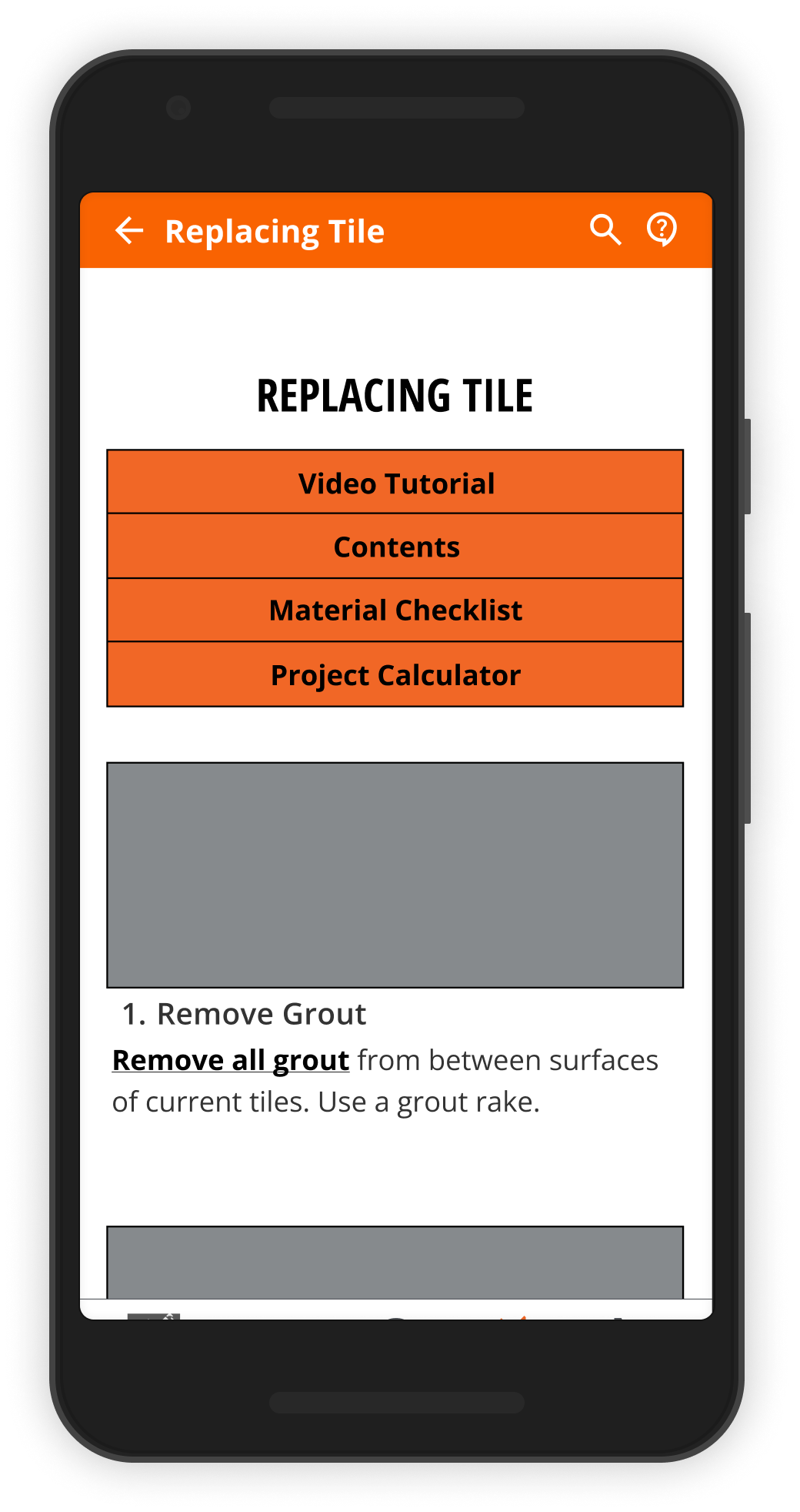
I led the ideation and wireframing for this project. From our user persona, I had two primary foci: Reduce cost of DIY projects, and help prevent user mistakes. To this end, I devised a solution I call the “One Stop Shop”, a form of all inclusive wiki that repackages Home Depot’s project guides and product listings into one complete package.
A step by step written guide as well as its corresponding tutorial video, so that visual and text learners are both accommodated.
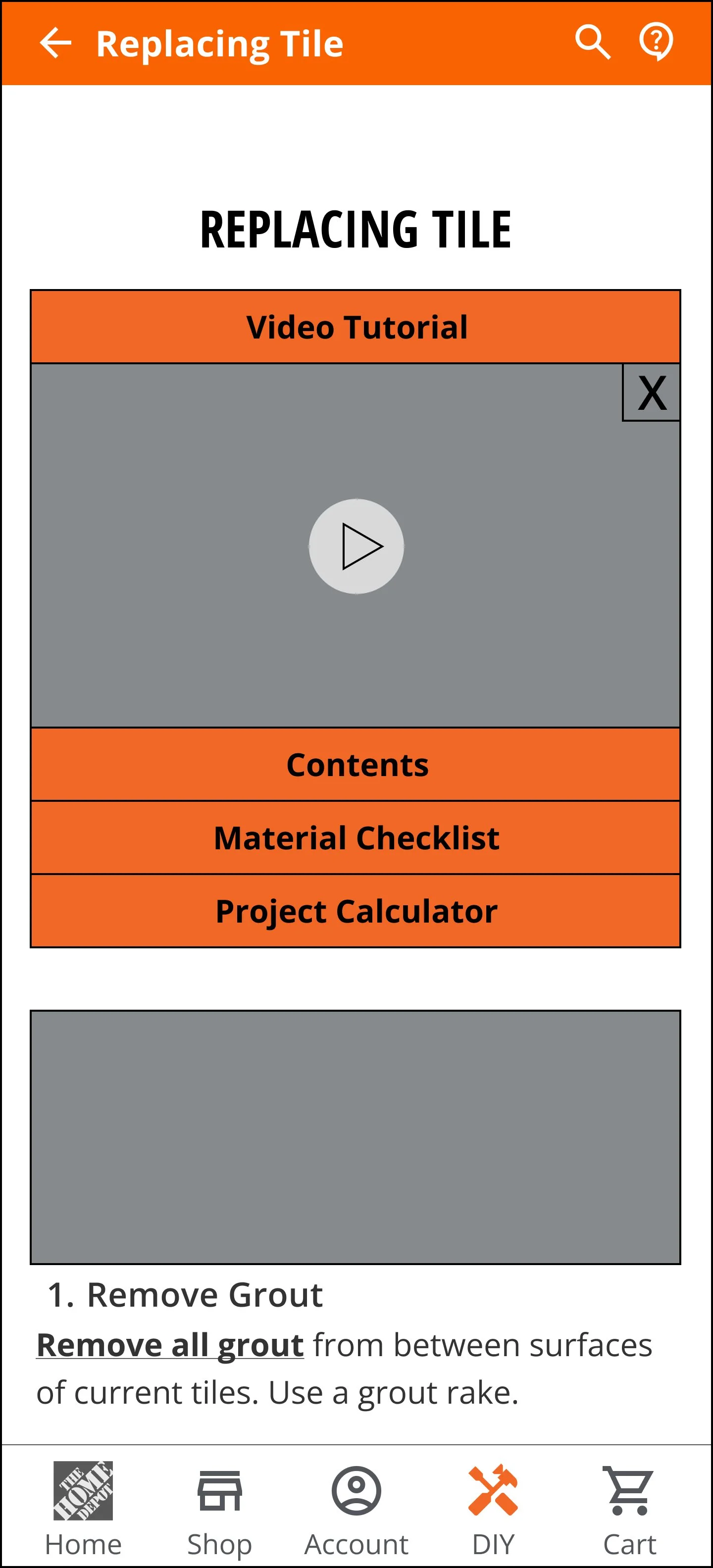
Project calculators tailored to the specific project, to allow for cost transparency.

A materials list with linked product cards and listings, to reduce the necessary trips a DIYer has to make.
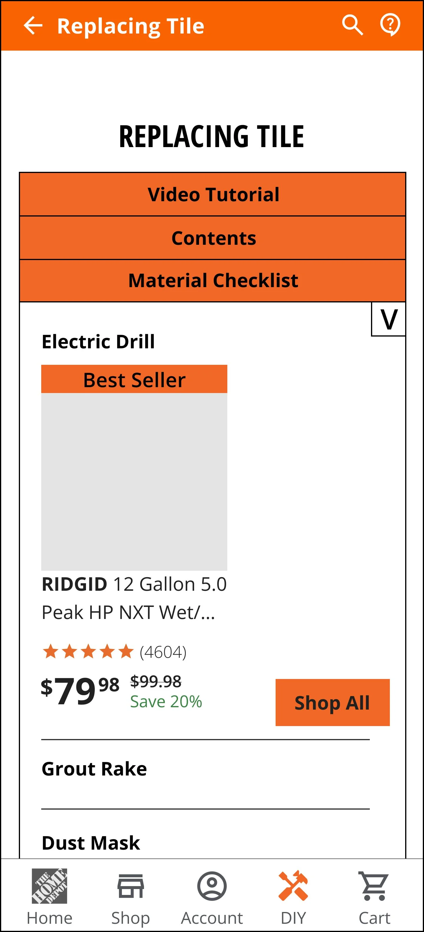
A chat box that allows for direct access to Home Depot’s in store experts.
Killing Our Darlings
As we got deep into wireframing, we hit our next “learning incident”. One of my teammates had been going to town building out a modal project calculator of our own design. She had spent several hours at the task, only to go back into the Home Depot site and find that, for the function we were trying to solve for, they already had a more robust calculator built. It was just hidden behind a worse calculator of the same type on a different page. We decided it was pointless to keep building out our own calculator, and instead resigned ourselves to making our calculator section a link to the ones Home Depot already had.

The Moment of Truth
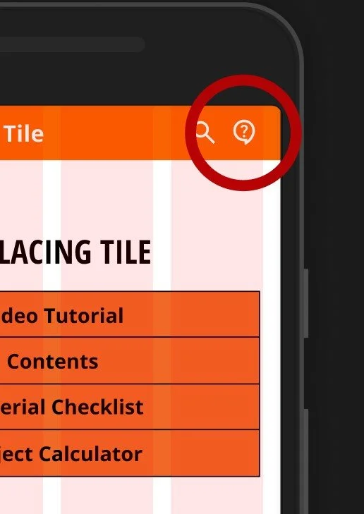
In addition to leading the design of our solution, I was also in charge of usability testing. Our results were a mixed bag: ¾ users found our guide and our calculator links without incident. However, only half of them found our materials checklist and its related product links without scrolling around the entire page. When it came to our chat box, it became even worse. Only one of our users found the link without excessive prompting. Some changes had to be made.
Cosmetic Surgery
The Chat Box
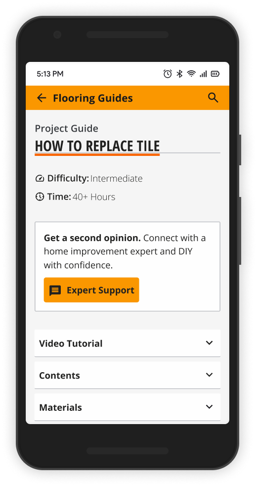
It was way too small, and it looked like a generic customer support link. So, we made it front and center in our DIY section, accessible from each page, with its own title and a much larger Call to Action button. While it is somewhat inelegant, that was not the goal of our Home Depot design. Utility above all else.
The Materials Checklist
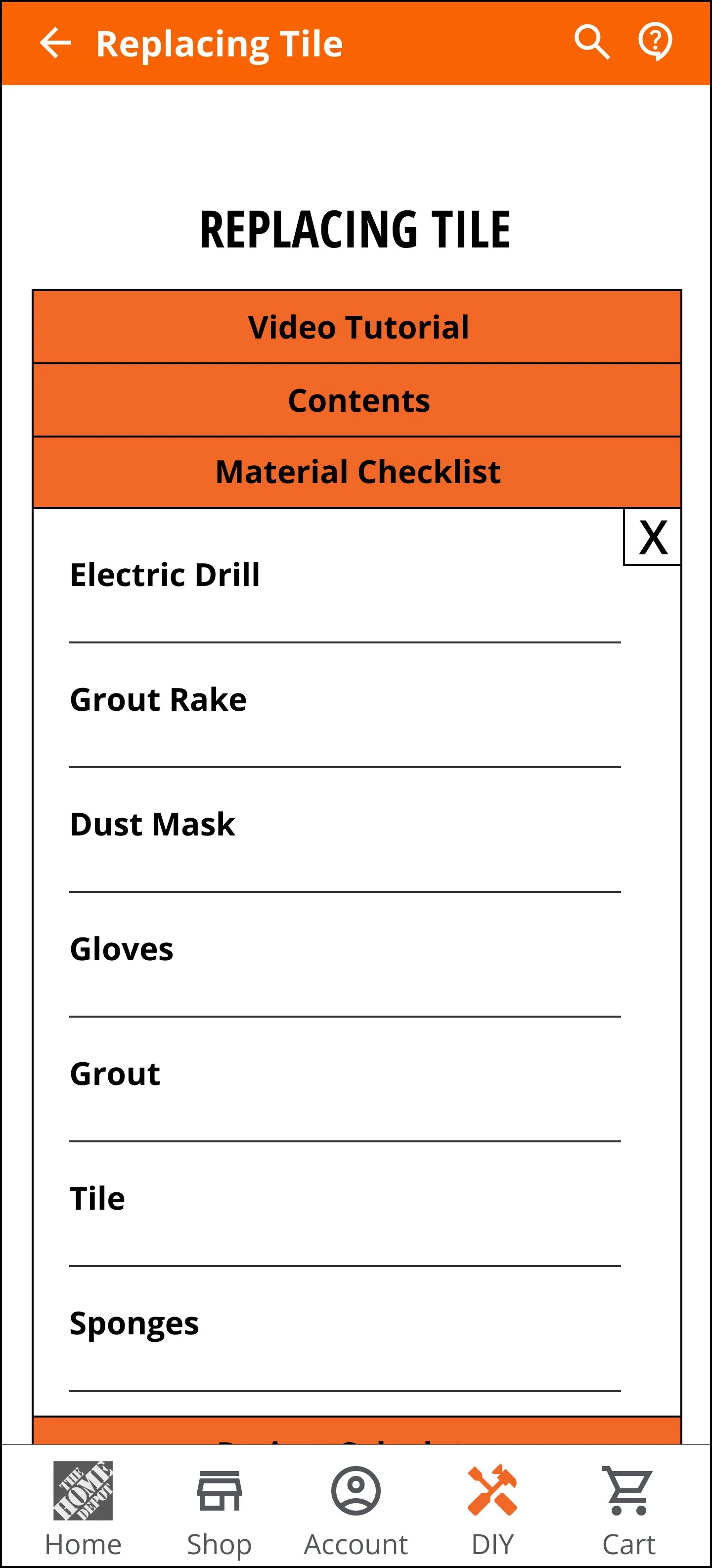
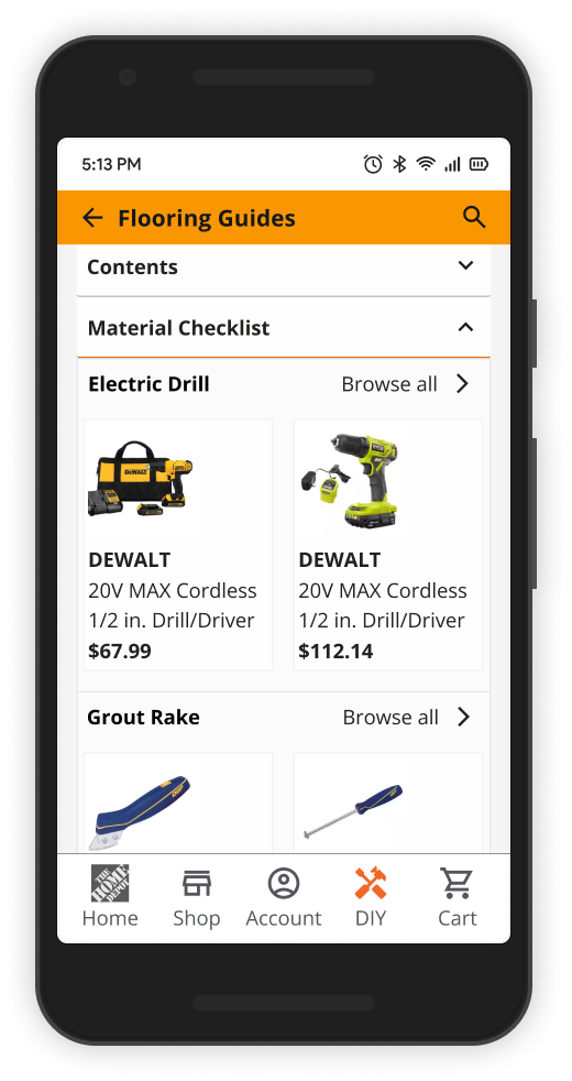
One of our users stated that it was too difficult to tell that my checklist featured buttons around the product names, so we had them open to the product card section from the start. No more seeking hidden buttons.
However, this does cause a new issue that I would address in a future iteration: The materials list no longer works as an easy to read list. I would make the drawer interaction more visible than my mid-fi design, but I would keep the functionality.
You Need to Watch Your Tone
This one’s short. Our initial persona and presentation used some phrasing that could derail our project. In our persona, we sounded a bit condescending when describing our DIYer. This could depersonalize them to the design team, and is a bad look. Likewise, in my section of our presentation, I referred to aspects of the initial Home Depot navigation as “terrible”. Not exactly how one should write about the hypothetical client they’re presenting to.