Beeli Travel App
Project Type: Product Design
Role: UX Designer
Date: April 2024
Building Beeli’s family travel planning interface from the ground up.
What is Beeli?
Beeli is a startup focussed on providing an all encompassing app for families traveling with children. At the time we worked with Beeli, they were very much in the beginning stages of their company’s conception, so we were tasked with the exciting challenge of building Beeli from the ground up.
Beeli’s Beliefs
Erica and Jade had a lot of ideas for what Beeli would provide, including but not limited to: travel inspirations, travel resources, and community building both digital and in person. Beeli’s founders brought us three things: Exploratory survey data, a basic brand kit, and a dream.
Beeli’s User Needs
The first step we took was to sort through their provided survey data, so that we knew how to approach our user interviews. For this, we chose to do some qualitative coding. There were about 200 responses between the two surveys conducted, which gave us a strong representation of what type of information Beeli still needed. The main focuses of our interviews were:, travel preparation, travel motivations, and thoughts on traveling with others or meeting new people abroad.
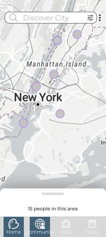
A Balancing Act
Erica and Jade’s vision for Beeli was somewhat at odds with the results of both their user surveys and our user research. The design solution they saw for Beeli initially, found in their initial sketches and our early meetings, envisioned a dating style app, where families at different locations would not only be able to share information with others in their area, but also coordinate times and places to meet. Our research showed little interest in this idea, and a much stronger desire for travel resources and user interfaces that were child forward.
Creeping Scope
Our attempts to fulfill all of the above aspects caused our low-fi stage to get out of hand, creating a tide of feature creep: Heat maps of families, various forms of travel itineraries, live updating reviews, all ideas trying to juggle a rapidly ballooning Beeli. We knew we had to narrow down the features into a product with a clear aim.
Refocusing
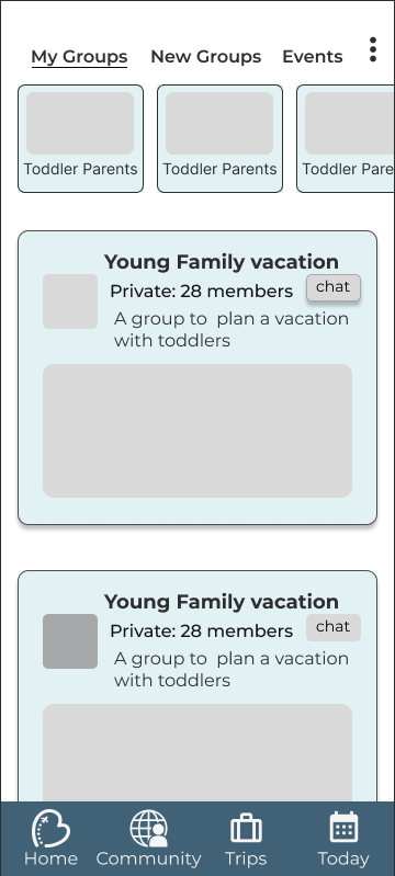
We chose to lean into the user demand for child focussed travel resources. To this end, we designed three solutions to parcel into the Beeli experience: A digital concierge, a flexible block based itinerary builder, and a user review section. The user reviews even allowed us to preserve the social aspect of Beeli’s initial brief.
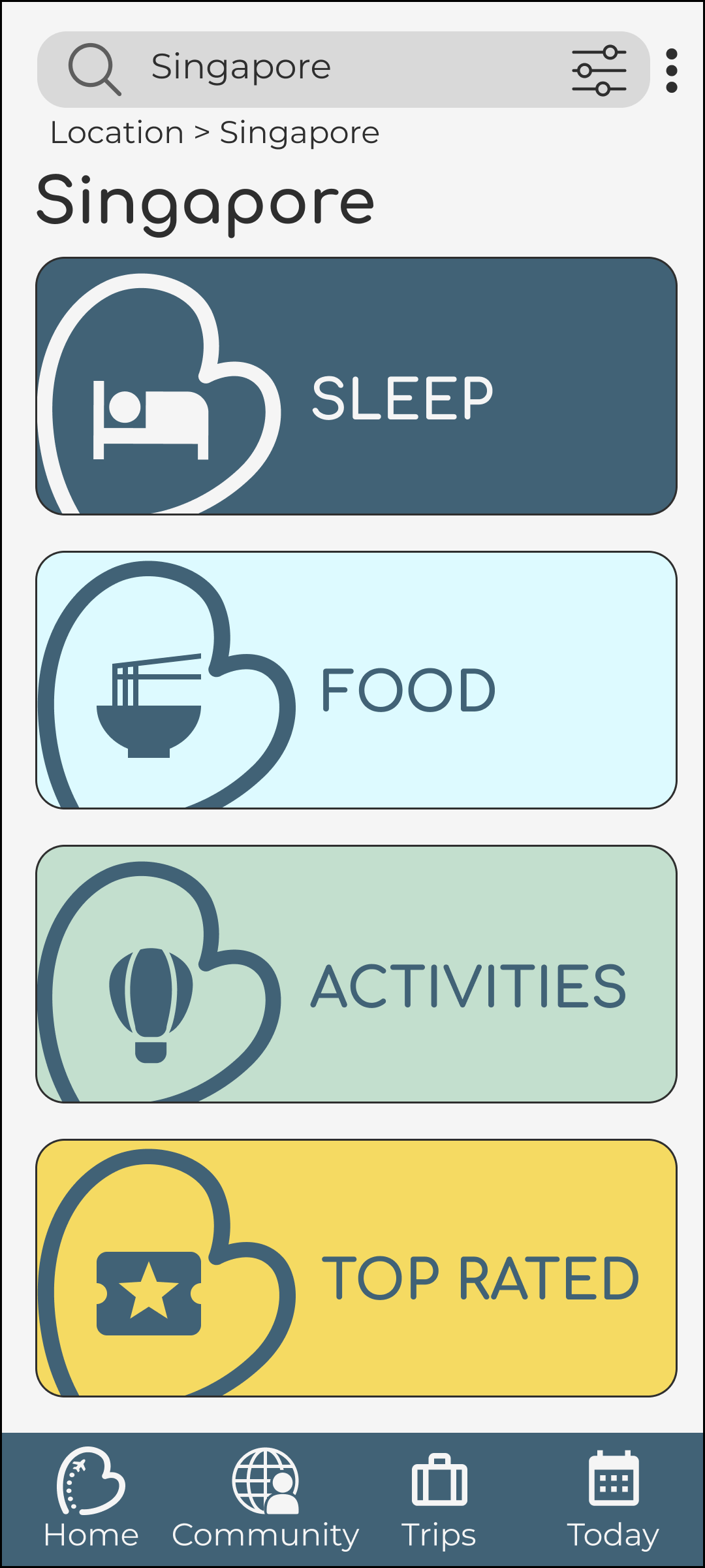
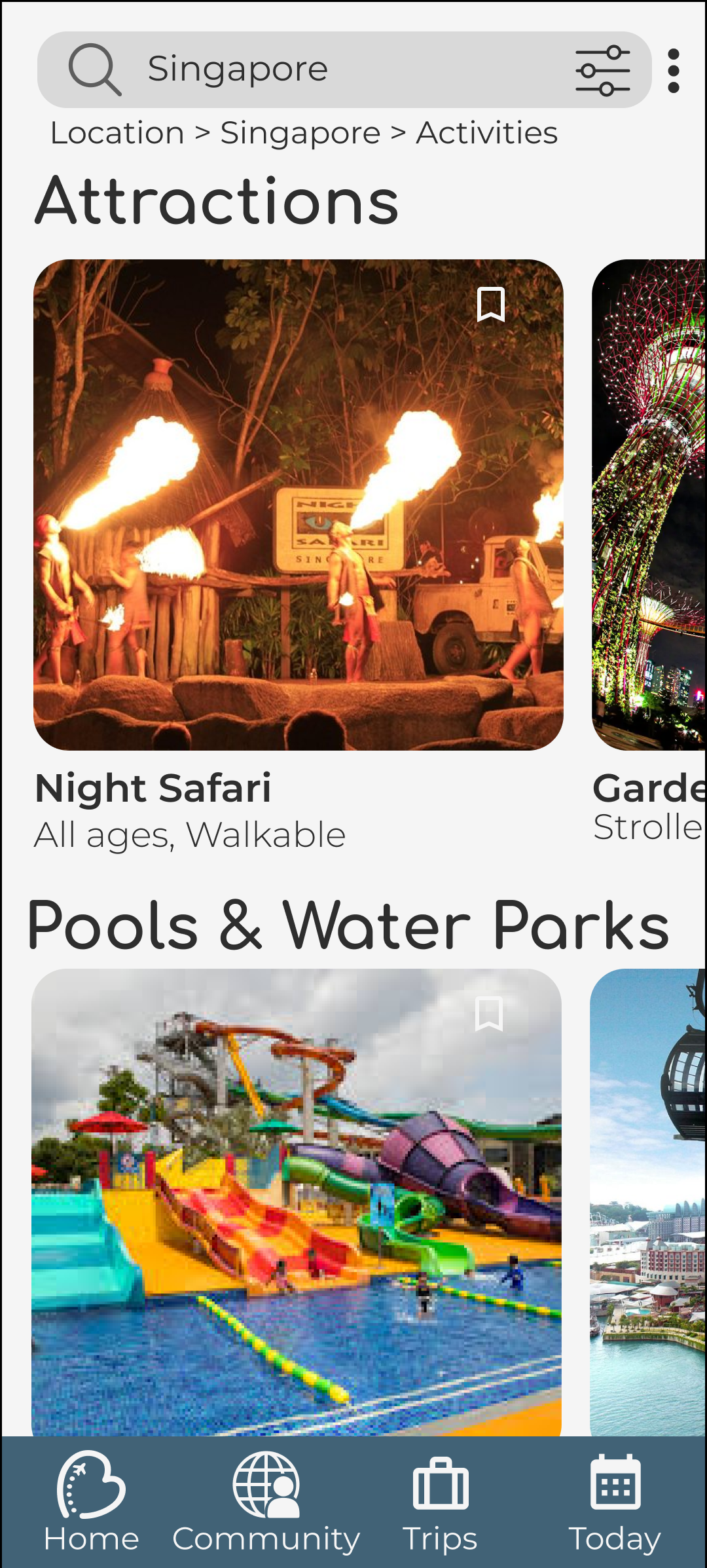
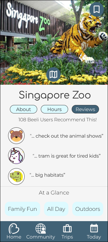
The Digital Concierge
The concierge is our resource hub, and where the Beeli experience starts. It features nested batches of locations and activities which eventually bring you to cards of specific locations. To excite kids, the location cards focus on images first. These cards can then be interacted with to add them to your itinerary as well as read and write reviews.
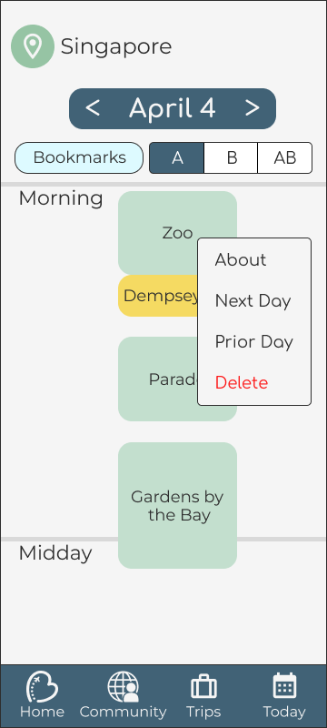
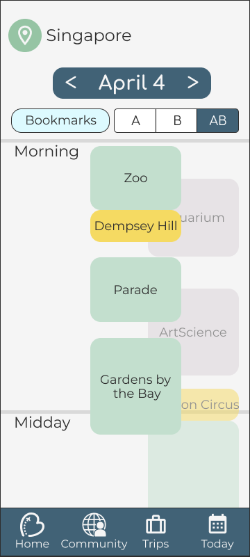
Fun and Flexible Itinerary
The itinerary was my baby. I had two goals in mind when building it: Make it fun to use, and make it as flexible as possible. It had to be fun to keep the family togetherness of Beeli at the forefront of the experience. The builder should be something that a kid would enjoy using with their parents while planning trips.
It had to be extremely flexible because of the chaos inherent to activities with young children. Their whims are ever changing, so the schedule should be able to change with them.
My solution to both of these challenges was one: Make the itinerary out of moveable and stretchable “gummy blocks”. Activities populated into a bin from the digital concierge were represented by color coded blocks that could be dragged and dropped onto a timeline, then stretched, squashed, or swapped around as needed. This would make the assembly of the schedule engaging for a child as well as make it easy to modify as needed.

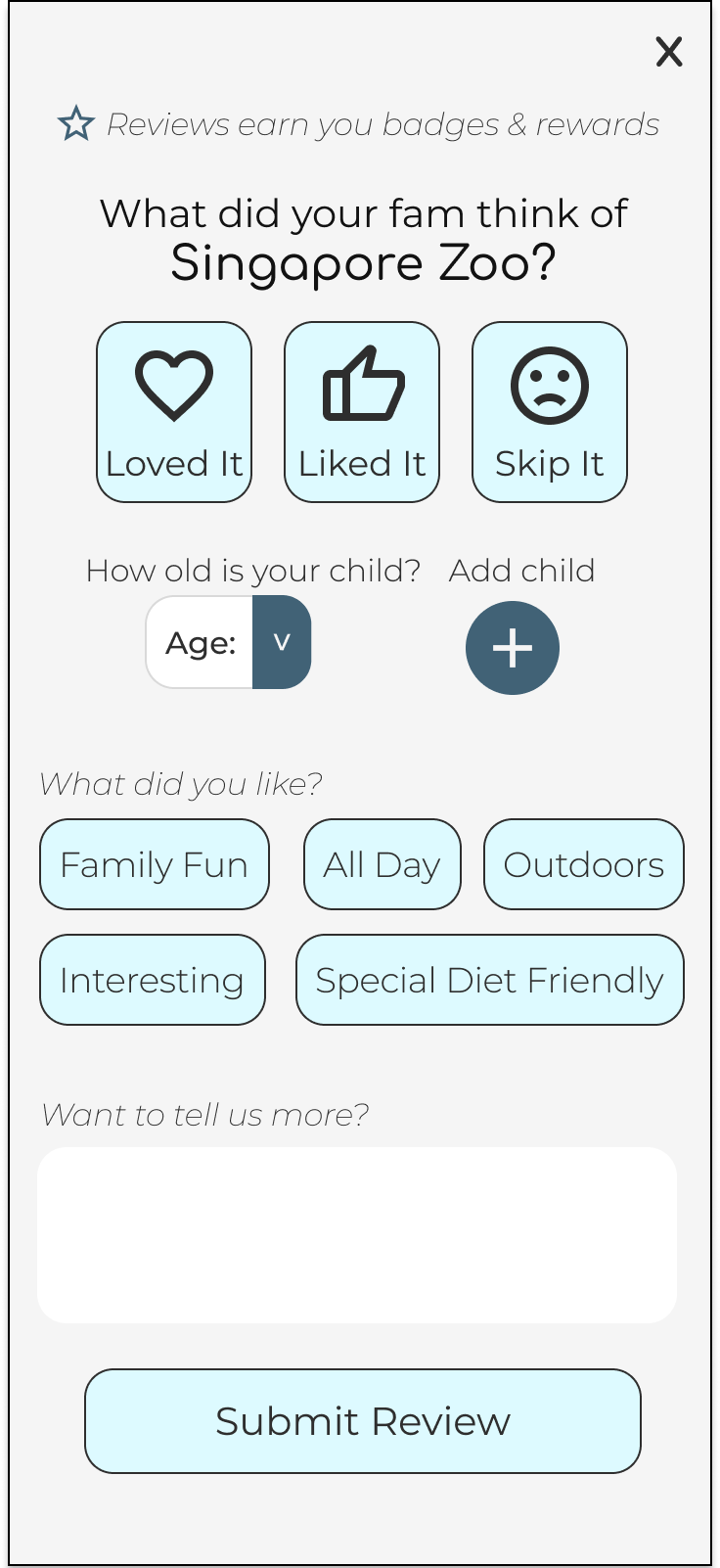
User Reviews, Family Style

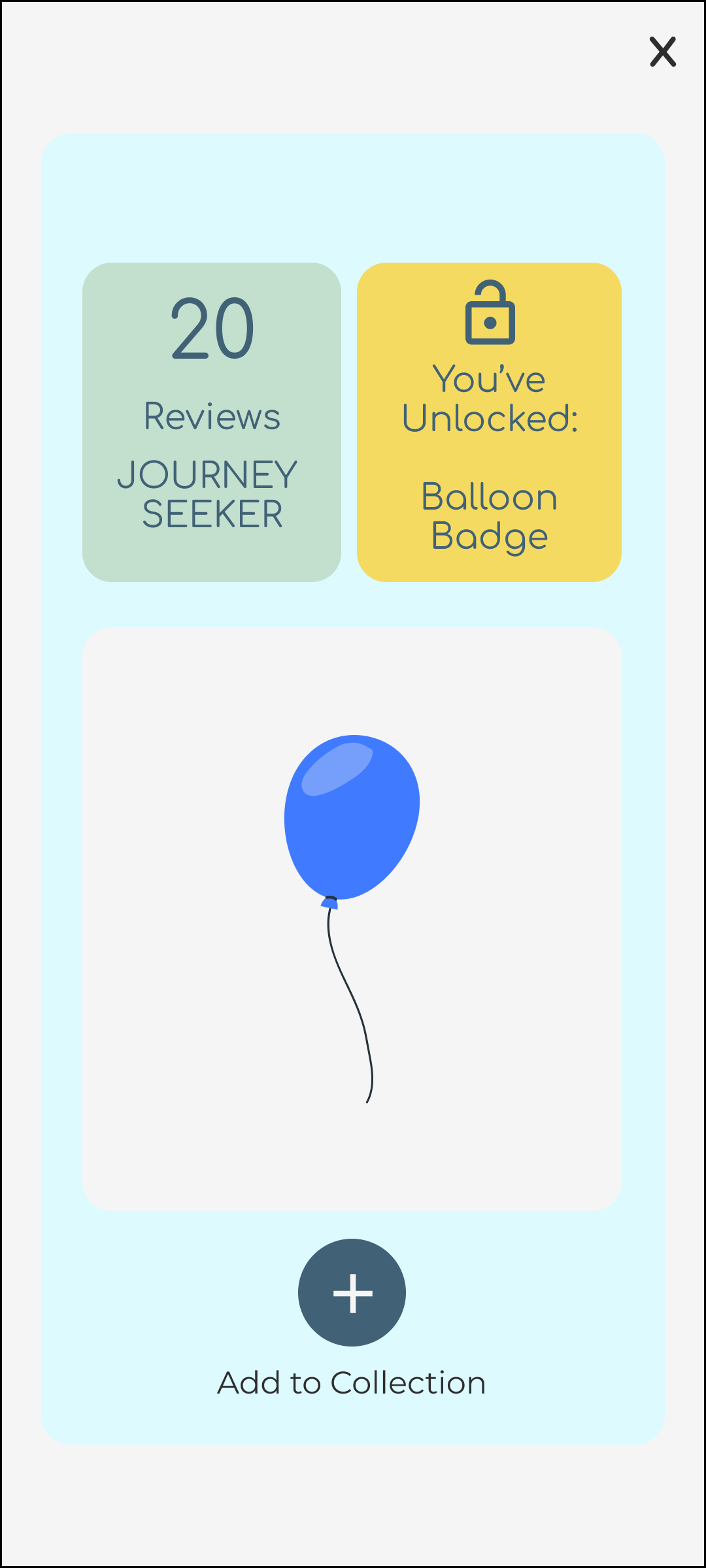
As a solution to the desire for Beeli to be a social product, we designed a review segment for Beeli users specifically. This would allow parents to see responses from the same demographic as themselves: parents and their children travelling. The basics of the review are extremely simple buttons, to encourage children and their parents to review the sites together. To this end, we also incorporated gamification aspects into the reviews, such as badge collection and points. This gamification would also serve to incentivize users to complete reviews.
Accessibility Alterations
We utilized the Beeli brand kit for much of our color choices. However, when testing the final designs for accessibility, we discovered that several of their colors didn’t WCAG contrast standards for text, and we made mild tonal alterations in our final product to remedy this.
If I were to redo this, instead of altering the brand’s colors, I would have changed our design to allow for the usage of Beeli’s colors. We incorporated combinations of Beeli’s blue and navy tones, both as text and fill together and paired with white fairly universally in the design, especially in the bottom navigation, so finding a way to preserve their branding would have been more cohesive to the product as a whole.


Ready for Takeoff
We had researched, strategized, and prototyped the Beeli experience. All we had left to do was pitch it to Jade and Erica. Designing an original experience and presenting to a true stakeholder were both new experiences for me at the time, but I’m happy to report that it went quite well.
The Beeli team was happy with where our product ended up, and while there was some remorse over the differences from Erica’s original concept, they accepted our compromises. Beeli was especially excited by my itinerary design.